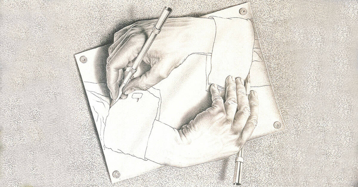
The demise of manual drafting
Moving office recently I came across many of my manual drafting implements that were essential tools in my early architectural career. Sadly, most of these are now largely redundant as computers have usurped their role. Unlike today’s CAD operators reclining in their comfortable chairs in front of their fancy 4k screens, Architects of the past were like jockeys, perched precariously atop adjustable stools, spreadeagled over giant drawing boards the size of dining tables. Like surgeons, their tools were meticulously laid out beside them, poised for use in the long operation ahead that would often extend well into the early hours of the morning. No nursing assistance was available for these hardy souls.
THE TOOL KIT
Whilst most surgeons would have discarded their pencil cases when they left school, Architects were required to retain them and outlay considerable sums to upgrade the contents to suit their newly acquired craft.
Throughout history, architects like Leonardo da Vinci have used pencils to sketch the outlines of their work on paper before being inked or painted, an early form of painting by numbers.
Consequently, the chewed stumps of old HB lead pencils had to be replaced by a varied assortment of different grade and thickness leads, not just encased in timber, but interchangeable in “mechanical” propelling pencils.
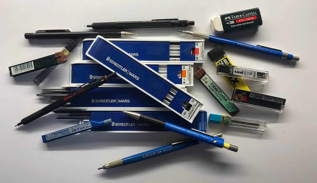
The old pencil sharpener would no longer cut it with all these new and varied forms of pencil.
Special sharpeners capable of honing leads to syringe like points were essential for the production of intricate and accurate hairline drawings.
Felt tip pens in a wide variety of thicknesses and colours replaced the assortment of cap-less Bic ball point pens found in every surgeon’s old pencil case or top desk drawer.
These were particularly important for producing the initial design sketches used to illustrate the design concept. Often very artistic and stylised drawings resembling a mass of indecipherable scribbles to most clients, they formed the basis for the more legible drawings to come.
To learn how to scribble like an Architect, refer to these tutorials.
For those clients unable to interpret their Architect’s sketch design, coloured presentation drawings were required.
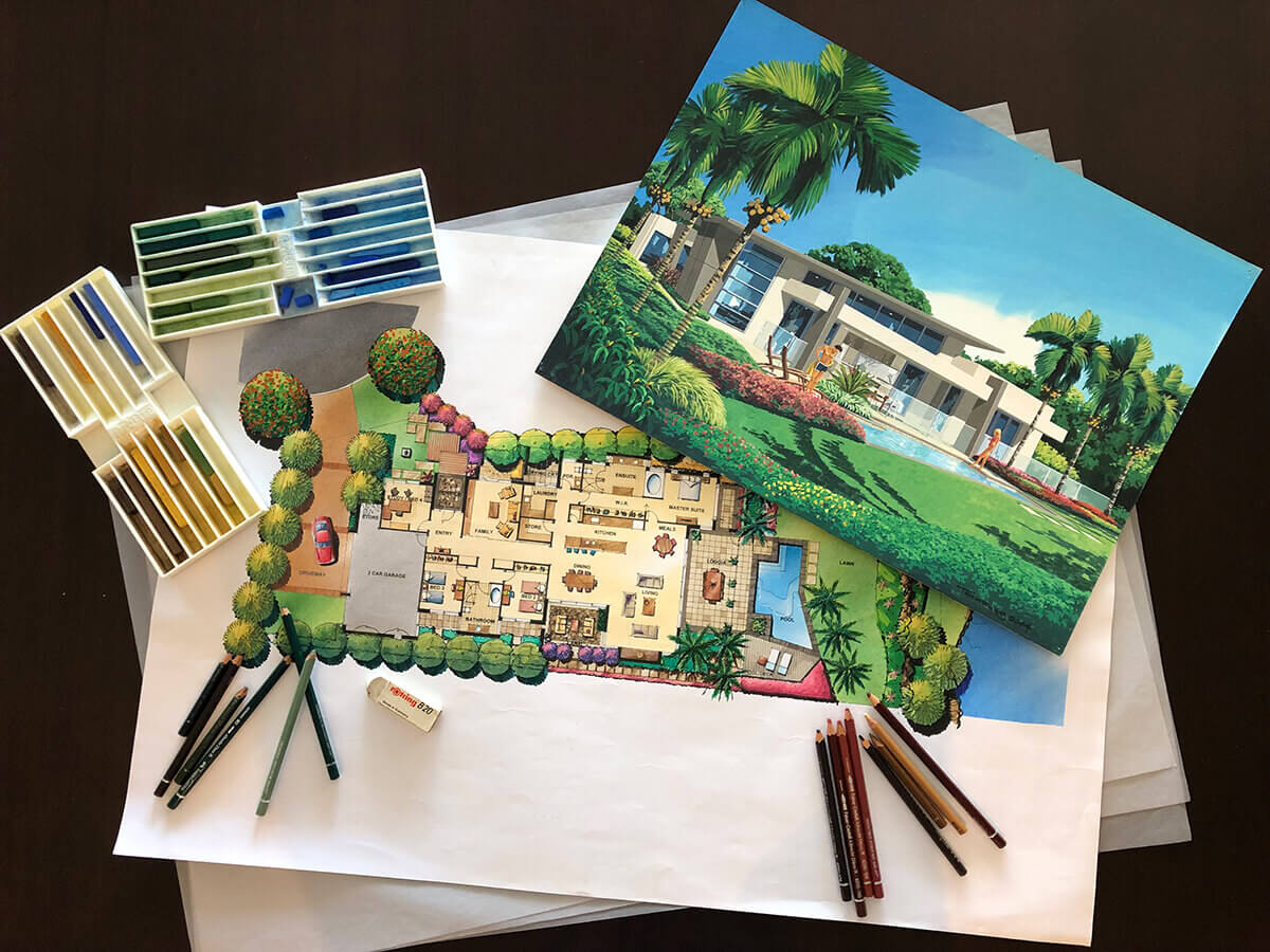
To produce these the standard 12 colour pencil set from school days had to be upgraded tenfold to a fancy European branded 120 colour set, particularly if you desired any form of street cred as a serious Architect. Refillable dual tip markers in a similar wide array of colours banished your trusty Texta colour set to oblivion. And for the truly artistic Architects, even more exotic colouring aids including pastels, water colours and air brush spray paints ensured you were the envy of all your peers, especially if you had the necessary skills to use them proficiently.
Ink pens no longer referred just to fountain pens, these were usurped by costly technical pen sets. Equivalent to the surgeon’s scalpel, these came in a wide range of nib sizes and were used to create the detailed linework essential for working drawings.

These pens were notoriously temperamental, prone to drying out and clogging up, or suddenly disgorging large ink blots onto your nearly completed drawing. To avoid this the pens needed to be cleaned regularly, and often the nibs, especially the finer versions, would require replacement.
A costly exercise equivalent to a round of drinks so avoided if possible.
Special erasers capable of dissolving ink after these mishaps should have seen the demise of the old abrasive pumice rubber. However, these trusty blue and red abraders still performed an essential role in smoothing out the gouge marks left in tracing paper drawings after scraping the unwanted ink off a stubborn mistake or an ink blot. This was done using an old-fashioned double-sided razor blade or surgeon’s scalpel. The skill in wielding these weapons determining how well the paper patient eventually healed and the ultimate lifespan of the drawing.
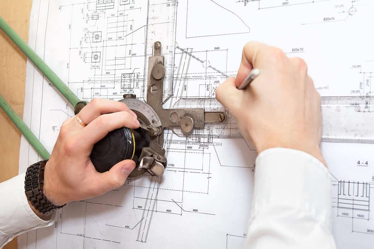
Much like the surgeon’s operating table, the Architects drawing board could be adjusted to varying heights and angles. They were used with large T- squares or fitted with various mechanical contraptions like parallel motions, or for those fortunate few, drafting machines – the ultimate architectural status symbol.
In conjunction with fixed and adjustable set squares, straight lines at varying angles could be produced relatively easily. Drawing complex curves however required masterful skills utilising various tools ranging from large radial compasses, to sensuous French curve stencils.
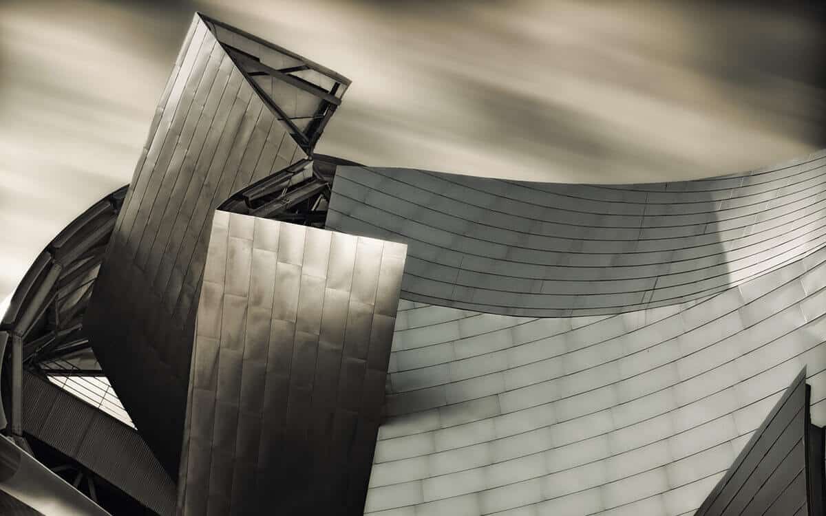
Frank Gehry and Zaha Hadid’s curvilinear designs would have won gold medals at a drafting Olympics in the pre-CAD world.
Drafting not only required the ability to draw lines, but these also had to be drawn accurately to a designated scale.
Essential to every Architect’s toolkit was the scale ruler. Not just one, but numerous versions representing different drawing scales, and for international work, different units – imperial and metric. For more information on the use of scale rules you can refer to this recent post: Reading Architectural Drawings 101 Part b.
Scale rulers were available in different lengths, shapes and materials.
These were often employed for important alternative uses such as slicing large sheets of paper in half or flinging rubber bands around the office.
ARCHITECTURAL SCRIPT
Doctors may be able to get by with their indecipherable freehand scrawls, however architectural script must be intelligible and easy to read. Whilst to the average layperson this architectural lettering appears to be a uniform style, it is as individual as fingerprints and can be readily analysed by other Architects to identify the author of a particular drawing.
Freehand writing however was not appropriate for all drawings, and often a precise uniform text had to be used. This was a standard required by some clients with poor eyesight, or a practical solution if multiple Architects were required to work on an individual or set of drawings.
This involved the laborious process of tracing each individual letter using a stencil of specific font and size. Larger letters needed a different stencil and a pen size to suit.
As technology evolved lettering machines, like a Dymo on steroids, allowed the text to be applied line by line after typing the content into the small keyboard. Equivalent to today’s texting.
Stencils were not only used for writing text, they were available for drawing standardised shapes and symbols ranging from circles to sanitaryware. These were often used as a method of evaluating an Architect’s kudos, the more stencils you owned, the more experienced you were.
In some cases where text size was too large or the font too stylised to suit stencil application, dry transfer lettering from “Letraset” sheets were burnished onto the drawing.
These dry transfer sheets were also available for applying lines, tones, patterns and complex shapes such as trees, people or vehicles onto drawings.

THE DRAFTING MEDIA
The Architect’s inanimate equivalent to the surgeon’s cadaver was drafting paper.
Architectural drawings were generally produced on various grades of translucent paper which allowed for easy tracing over other drawings, but more importantly for reproducing multiple copies from each single original drawing.
Drafting onto tracing paper was fraught with potential problems. Like Frankenstein, paper was prone to taking on a life of its own. This was especially common in humid environments or where exposed to body sweat from the prostrate Architect sprawled all day and night over their drawing in an attempt to finish it by the impossible deadline.
This would cause the tracing paper to distort, buckle and grow in all directions much like the middle age spread experienced by CAD draftsmen today.
The consequence – out of scale prints, so in severe cases, the drawing would need to be euthanised and a new fresh clone produced.
Tracing paper was also prone to tearing and developing holes from the inexperienced architectural surgeon wielding a razor or scalpel incorrectly attempting to correct mistakes or ink pen mishaps. Older drawings often resembled a seasoned warrior, covered in jagged scars patched together by lengths of clear adhesive tape.
THE PRINTING PROCESS
Some people believe that reproduction is the purpose of life. In the case of the architectural drawing this is entirely true, albeit more akin to genetic engineering. Multiple clones of original drawings were produced and dispatched into the outside world for a new life, whilst the original was safely retained in the Architect’s office awaiting further surgery.
Since drawing sheets were generally much larger than most flatbed photocopiers of the era could handle, the process of creating print copies from the originals was an arduous one, in today’s world equivalent to a form of child slave labour.
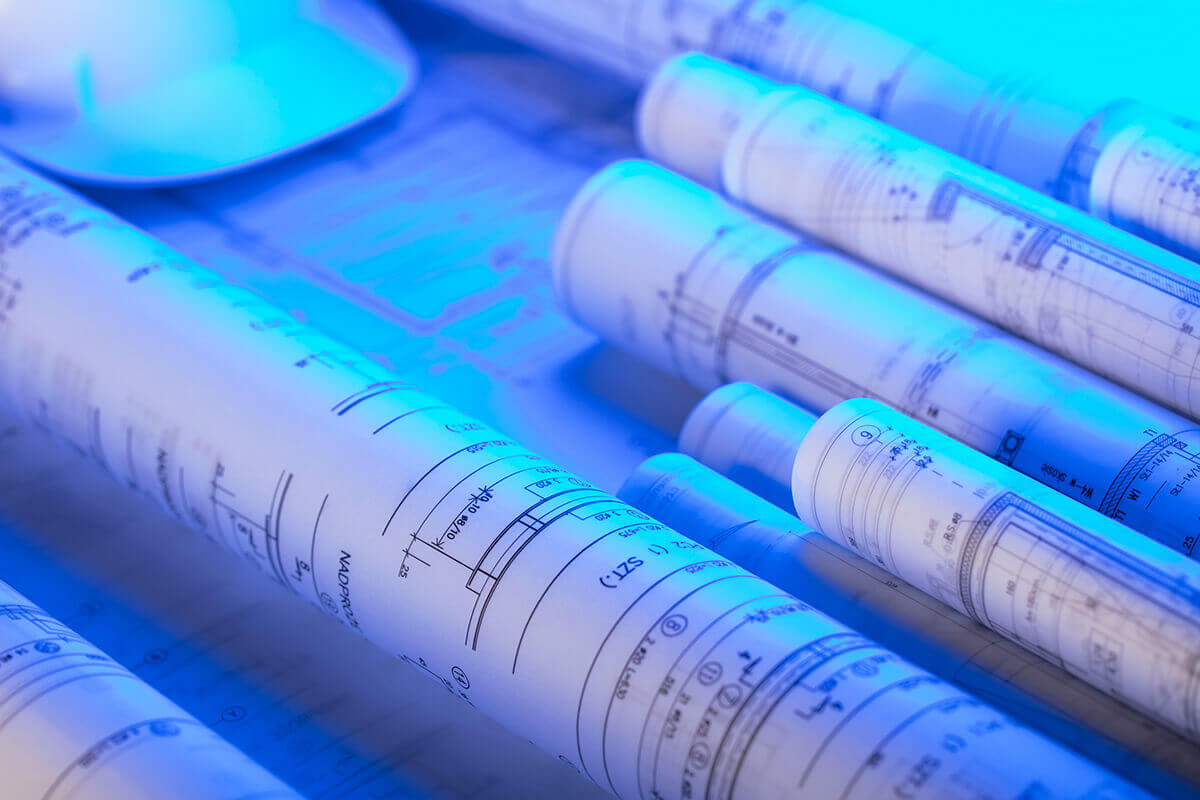
The most junior person in the architectural office, often still of school age, would be given the role of print boy / girl and banished for days at a time to the toxic print room. Every print copy made involved placing the tracing paper original over a sheet of reactive paper and aligning it perfectly. This combination was then fed through a wringer type set of rollers into an ammonia bath, and then past a UV light which activated the paper and created a “blue print”. The resultant wet copy had to be hung out to dry as the ammonia evaporated into the air and lungs of the poor printer.
This video illustrates how cumbersome and time consuming this process used to be.
As large projects often required dozens if not hundreds of prints to be issued to consultants and builders by strict deadlines, this was not a coveted role in any architectural office.
And woe betide the print person who accidentally allowed the original tracing paper to follow the copy paper into the ammonia bath, often ruining the original drawing.
Over time with advancing technology this printing process evolved into a far less hazardous experience, however the value of the single original drawing didn’t diminish until the advent of computers and plotters that could produce multiple “originals” as required, and eventually multiple copies as well.
THE VERDICT
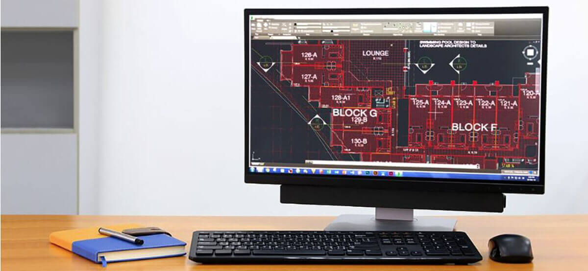
Whilst the demise of manual drafting techniques may be lamented, the modern Architect is no longer as susceptible to spinal injuries or paper cuts.
Instead these afflictions have now been replaced by Carpal Tunnel Syndrome, Computer Vision Syndrome, and Musculoskeletal problems.
Even with the latest advances in computer technology and sophisticated software, the architectural profession continues to be a hazardous one.
4 Comments
You might also be interested in...

The Latest Trends In Swimming Pool Design
Discover why smaller plunge pools are becoming Australia’s preferred choice in 2024. Learn about costs, trends, and smart features.
Exploring the Artistic Side of Architecture
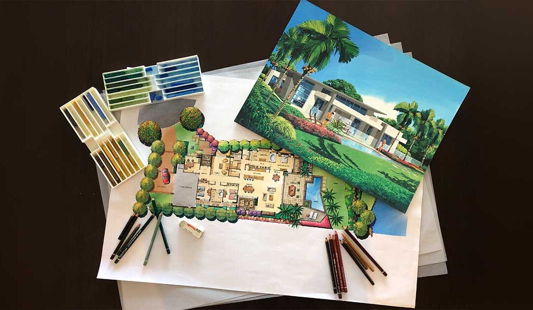
Explore architecture’s artistic soul through sketches and drawings. See how these visual tools bring architectural visions to life.


Wonderful article on the lost skills of the Architect. A ‘real’ architect can sit in front of the Client and sketch out their thoughts to capture the Client’s briefing discussion … there is nothing to replace the old butter paper sketches and tracings. So much for the loss of these so valuable skills.
Thanks Tony, fortunately there are still some of us “old school” Architects who’ve learnt how to marry the best of the old with the advantages of the new.
Ahhh memories John! But not so dim, my desk is still strewn with pens, scale rules, stencils and butter paper. The clients still admire the hand sketches and thankfully my colleagues translate the sketches into CAD documents preferred by Builders and Authorities. Sadly the skills that we older architects spent years developing are disappearing with reliance on computers. My files are full of drawings no doubt similar to yours with strange red circles here and there!!
Cheers Ron
It’s a sad reality Ron, although CAD drafting and 3D CGIs have made doumentation and presentation much more efficient, they certainly lack the flair and personality of good manual drawings. I’m pleased that you haven’t succumbed to the inevitable and have found a way to keep using your beautiful artistic hand.