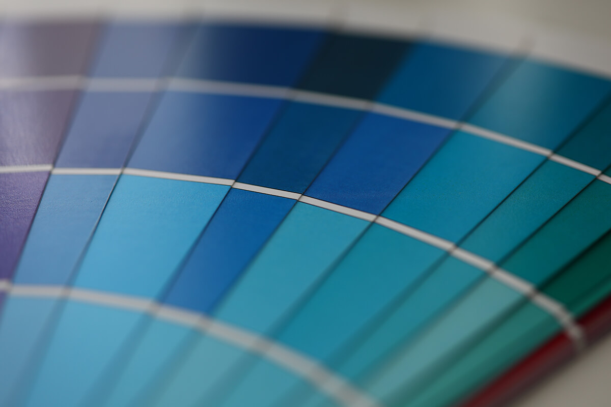
Pantone Color of the Year 2020 – Classic Blue
The news is officially out. The much-anticipated Pantone Color of the Year for 2020 has been announced and they’ve selected 19-4052 Classic Blue.
Pantone create colour shades from a palette of 18 basic colours offering a much wider colour range than other colour coded systems.
Pantone’s colour forecasts are the reigning authority for a multitude of design related industries including Architecture and Interior Design.
Classic Blue as described by Pantone is “a timeless and enduring blue hue elegant in its simplicity”. It is a somewhat reliable colour. A more subdued alternative to its predecessor, 2019’s Living Coral, a vibrant pink colour.
Pantone justify their choice… “this enduring blue hue highlights our desire for a dependable and stable foundation on which to build as we cross the threshold into a new era”.
It may seem that Pantone have played it safe with this year’s selection. However, as we enter an uncertain new decade where the world appears to be in a state of flux, a favourite colour such as Classic Blue can reassure us by providing a sense of familiarity.
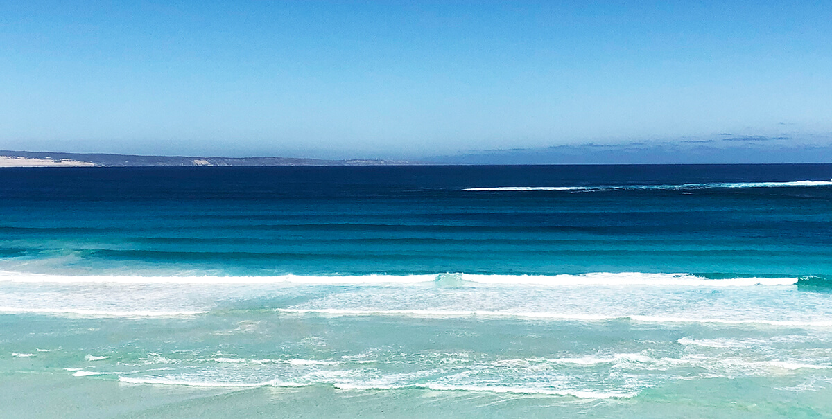
So, what is Classic Blue? Forget about the technical colour codes that define it, Classic Blue can simply be interpreted as the azure blue colour of the deep ocean, or the inky sky at dusk.
It’s been a while since we have seen such a natural colour from Pantone used as the Color of the Year. We suggest a few ways that you may be able to incorporate Classic Blue within your home design.
How to Incorporate Classic Blue in Your Design
As Gold Coast Architects, we are fortunate to be so familiar with the numerous hues of blue that we see daily when viewing a clear sky or gazing out over the ocean that borders our city.
Many artists and designers draw inspiration from the colours of nature. It is a tradition that is as old as civilisation itself. Anyone who has travelled through countries bordering the Mediterranean Sea would be familiar with the whitewashed walls and brightly coloured feature doors and windows that define the local architecture. Greece is a classic example. Being a major seafaring nation, the country has always had a close affinity with the colour Classic Blue.
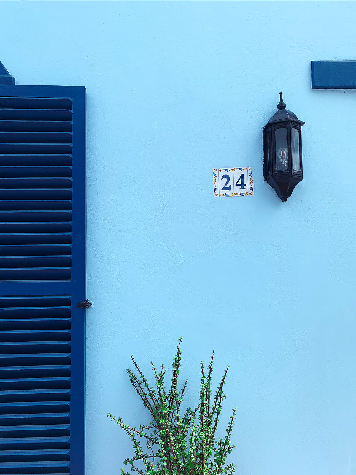
Whilst we are certainly not suggesting that neo-Greek architecture will suddenly become vogue in 2020, as the Greeks have demonstrated, by limiting the use of bold colours to feature elements, there are subtle ways to introduce the Classic Blue into your home design.
Blue on Blue
Various shades and hues of blue are already found in the colour ranges of many building materials commonly used today.
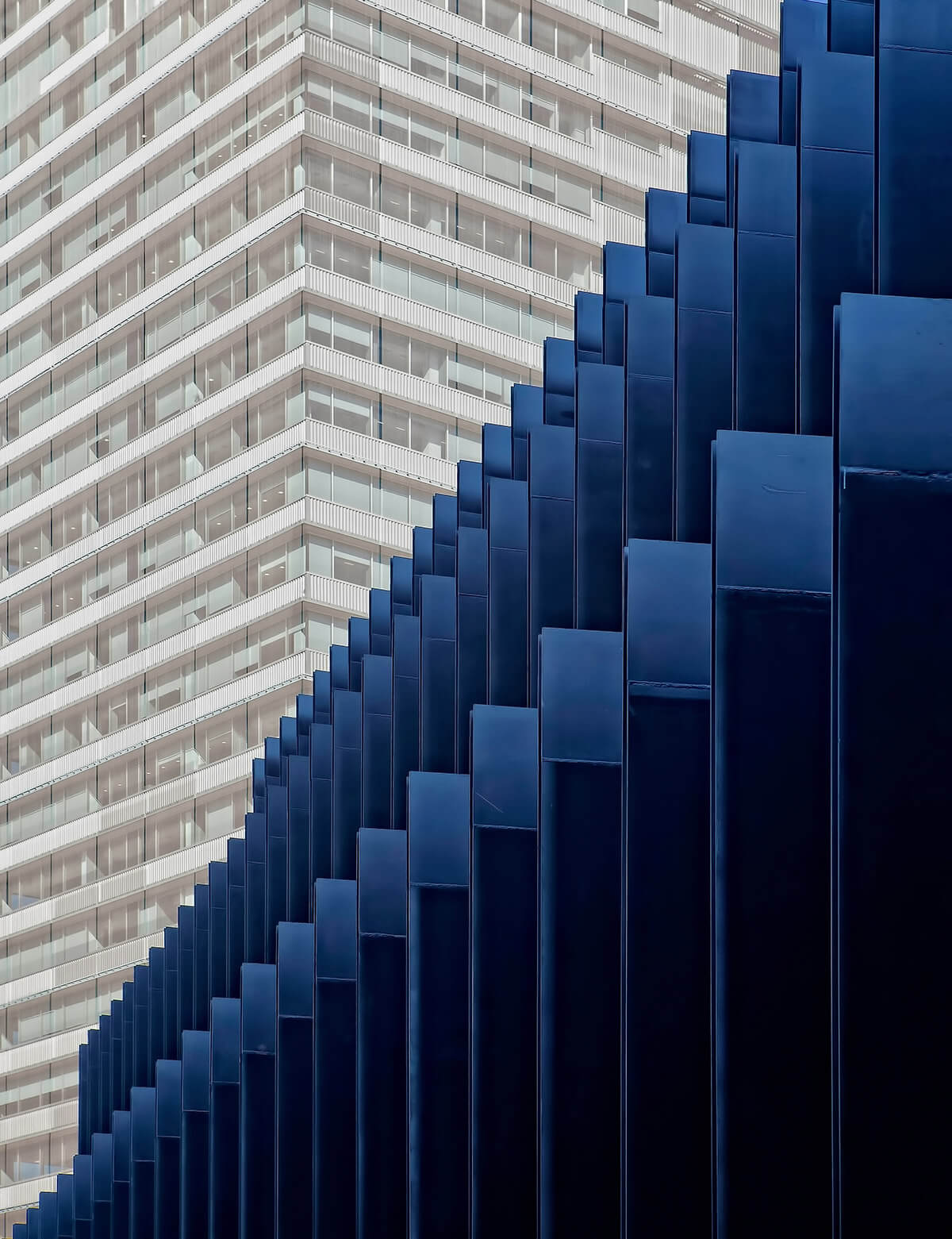
Dark blue / grey slate roofing tiles, both natural and replica, are very popular now. The new Colorbond range of metal roof coatings also offer Deep Ocean blue. This is also available as a standard powdercoat colour used by many window manufacturers and other aluminium fabricators.
Natural stone cladding or flooring with blue and grey tones is also commonly used in residential architecture.
Applying Classic Blue to certain feature building elements complimenting or contrasting with these other coloured materials will create a bold visual statement.
Classic Blue has also been used for many years on the Gold Coast as a popular colour for swimming pool tiling. The inky blue creates a dark water colour imbuing it with a sense of depth and cool refreshment, recreating a patch of deep ocean in your own backyard.
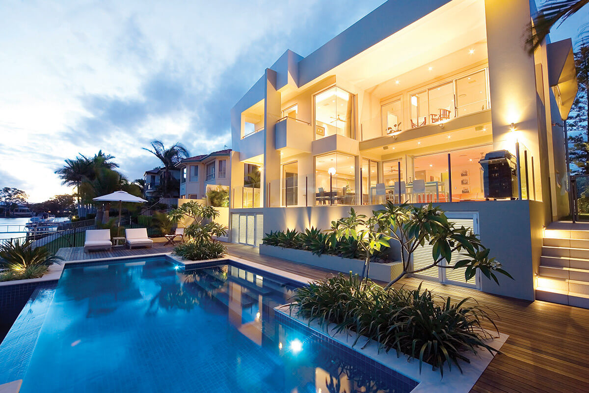
Whilst Classic Blue has many external applications, it can really be featured much more confidently within the interior of your home.
Classic Blue inspires “calm, confidence, and connection”.
It works well on larger areas including feature walls and even floors, and can even be applied to floors.
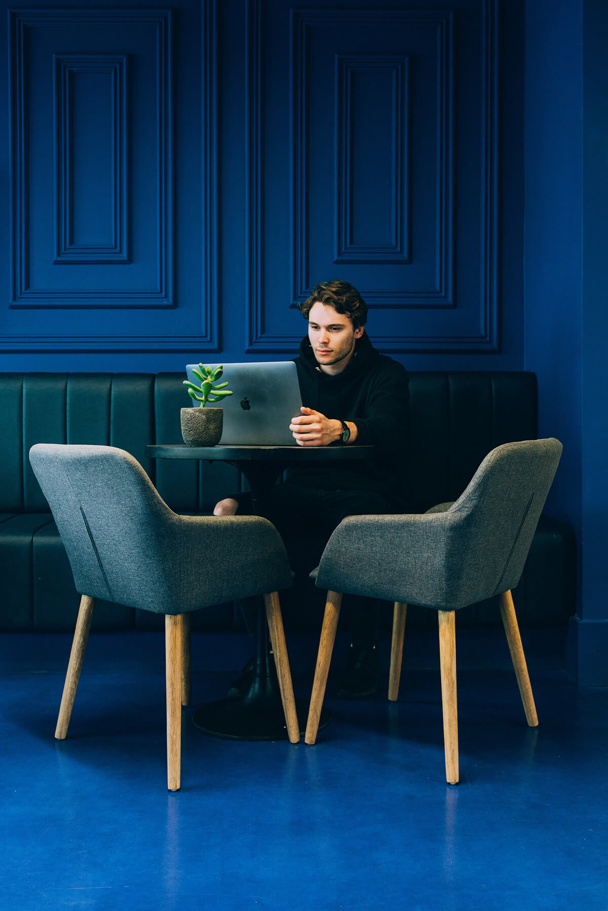
Blue walls combined with a contrasting white trim can brighten up a bathroom for a fresh feel that gives a classic but bold look.
The calming effect of Classic Blue also makes it an ideal colour for bedrooms.
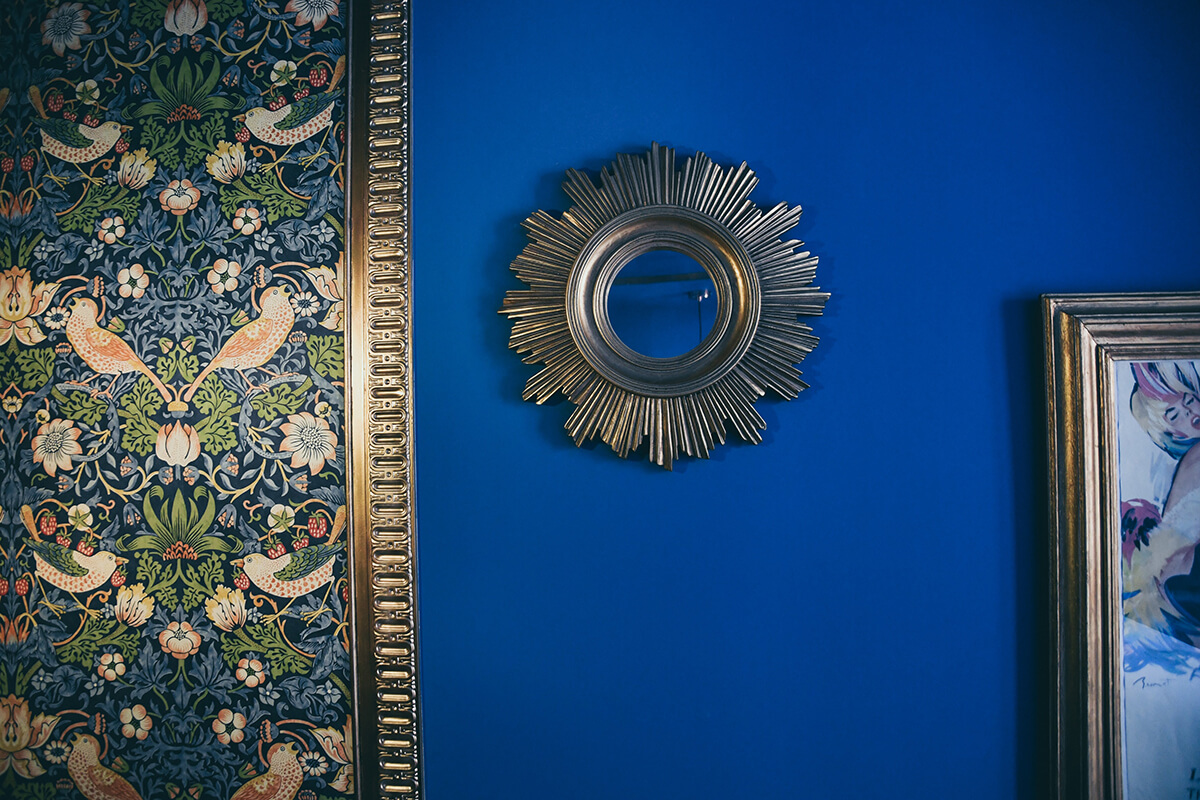
As strong feature colours tend to have a limited lifespan, a more practical way to incorporate Classic Blue into your home design is to limit its use to soft furnishings. Colouring accessories like artwork, floral arrangements, cushions, throws, rugs, bedding and other easily replaced items allows flexibility to change colour schemes on a regular basis.
That way you can easily keep your home up to date with the latest Pantone colour selection without the need to rebuild or repaint your house every year!
Looking for more design inspiration? Check out our blog on Emerging Trends in Residential Architecture.
Read more about Pantone 19-4052 Classic Blue, the Pantone Color of the Year 2020 on the official Pantone Australian website.
Pictures on wall photo by Vinicius Amano on Unsplash
Buildings photo by Ricardo Gomez Angel on Unsplash
Shutters photo by Andrei Slobtsov on Unsplash
Floor and wall photo by Štefan Štefančík on Unsplash
You might also be interested in...
The Most Popular Home Configurations in Australia in 2024
Discover 2024’s top Australian home configurations: bedrooms, bathrooms, and parking preferences. Explore how changing lifestyles shape popular house configurations nationwide.
Exploring Contemporary Applications of Brise Soleil
Contemporary applications of Brise Soleil combine functionality, aesthetics, and sustainability, making them a popular choice in various building designs worldwide.


