With the current Covid 19 pandemic confining most of us to our homes for extended periods every day for the foreseeable future, the perception and enjoyment of our indoor spaces has probably never been under such intense scrutiny.
The role colour plays in our perception of our internal space is an important one to understand.
Colour psychology, the impact various colours have on our emotions is a complex topic to be addressed in the future.
Instead, in this article we provide a simple overview of the different spatial effects that can be created by simply using contrasting colours on walls and ceilings within our internal spaces.
The Fundamentals
Lighter colours reflect light, darker colours absorb it.
In much the same way as black jeans make us look thinner, dark spaces appear smaller.
Consequently, applying contrasting light and dark colours to different surfaces within any room can create a variety of different spatial effects.
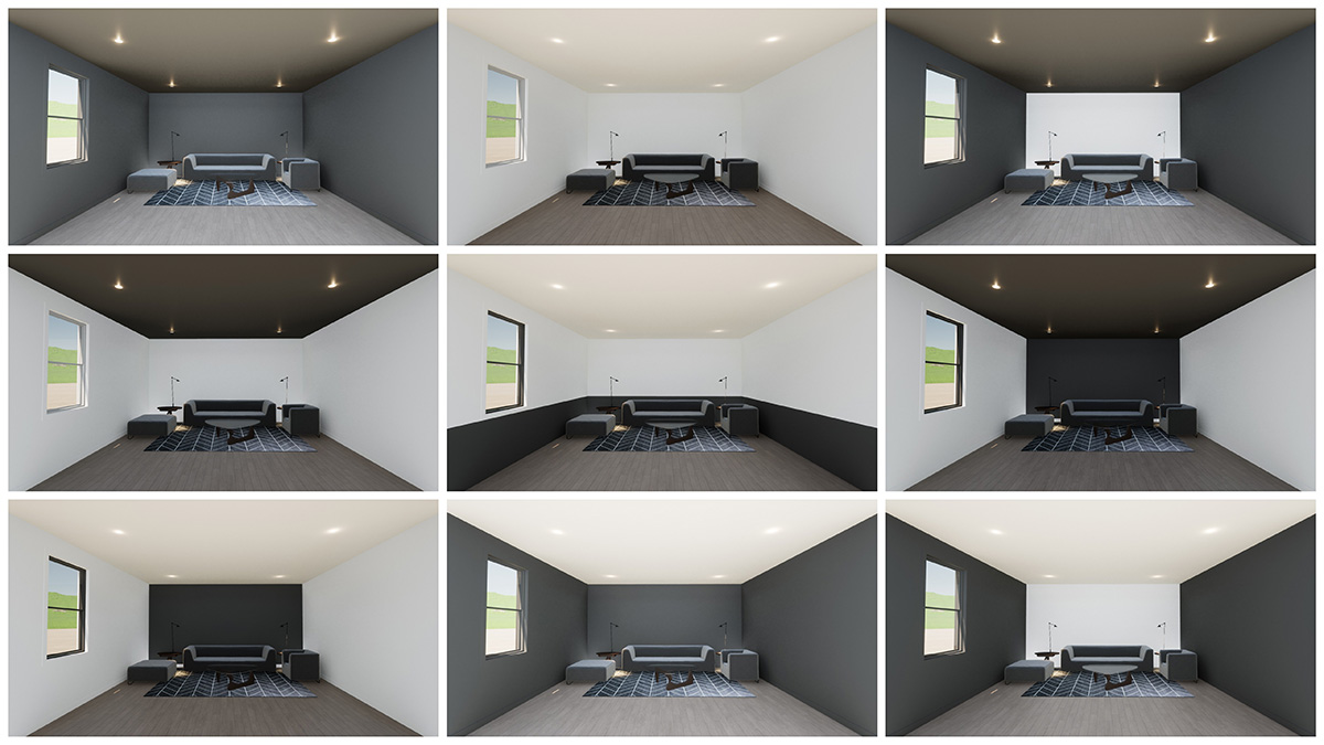
The above illustration demonstrates how absorption or reflection of light can also change our perception of colour within a space.
Whilst the floor colour is uniform in every room and only two different paint colours (one light, one dark) are applied to the walls and ceiling, the colours on different surfaces can appear to be quite different. This is due to variations in reflectivity and light absorption on the different planes.
If a room is considered as a cube, 4 of the 6 internal faces are walls, so they have the greatest potential for applying contrasting colours to create a desired appearance.
Walls and ceilings also play an important role when combined with different wall colour combinations.
Enlarging a space
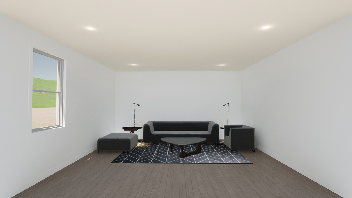
Minimising contrast and using lighter colours to walls and ceilings maximises reflection of light.
This creates the impression of a larger more open space, ideal for living areas, or dark internal rooms that may otherwise feel cramped and small.
Reducing a space
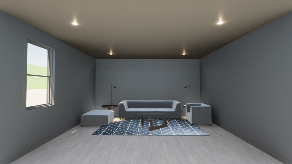
Conversely, applying dark colours to walls and ceiling has the reverse effect, absorbing light and making the space feel smaller and more compact.
This effect is useful for creating “cosy” spaces for rooms that are predominantly used at night like bedrooms, or formal dining rooms.
It can also be useful in reducing the perceived scale of oversized spaces like double storey voids in industrial style loft apartments, a design trend having a revival in 2020 which is also discussed in our recent article Top Architectural Design Trends 2020.
Increasing Height
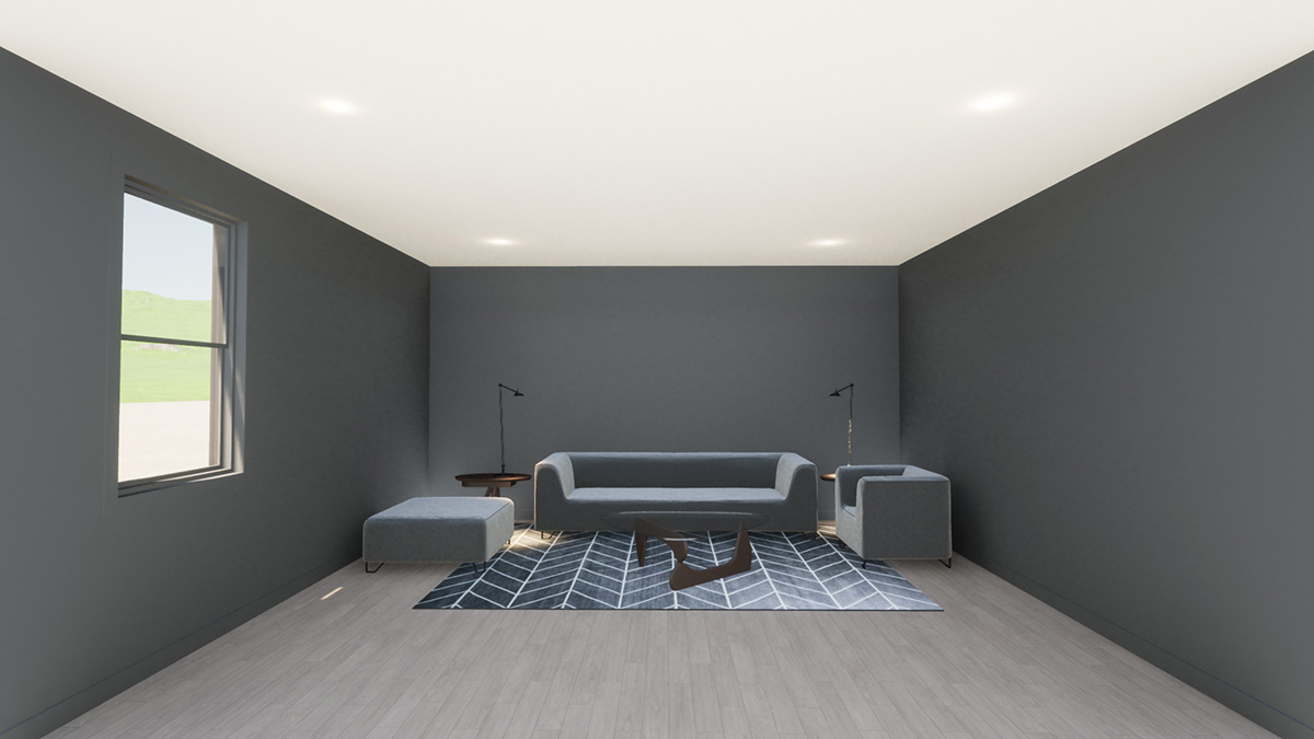
Where rooms have relatively low ceilings, to improve the sense of increased height, using a light-coloured ceiling with dark contrasting walls lifts it higher.
Reducing Height
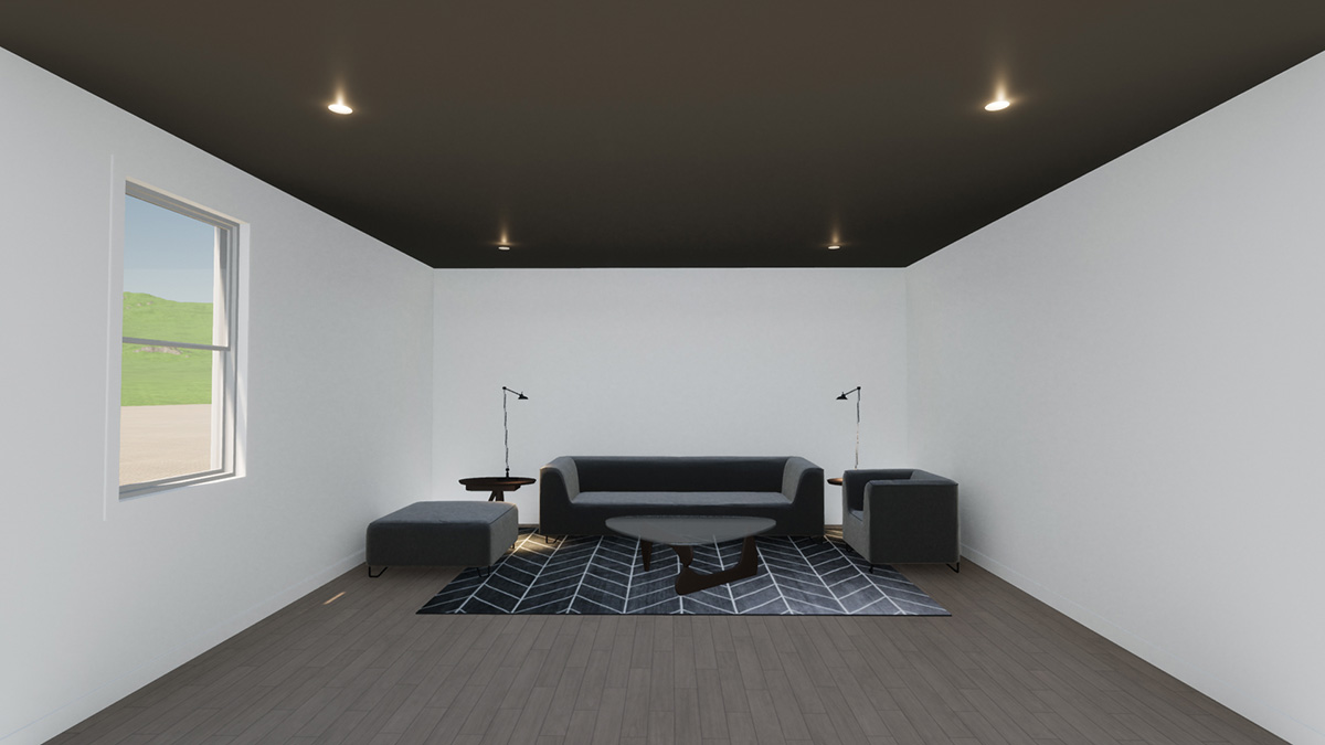
Reversing this combination has the opposite effect, making a ceiling feel lower.
Applying a dark colour to the ceiling reduces reflection and brings it down.
This can also have the effect of making the room look wider.
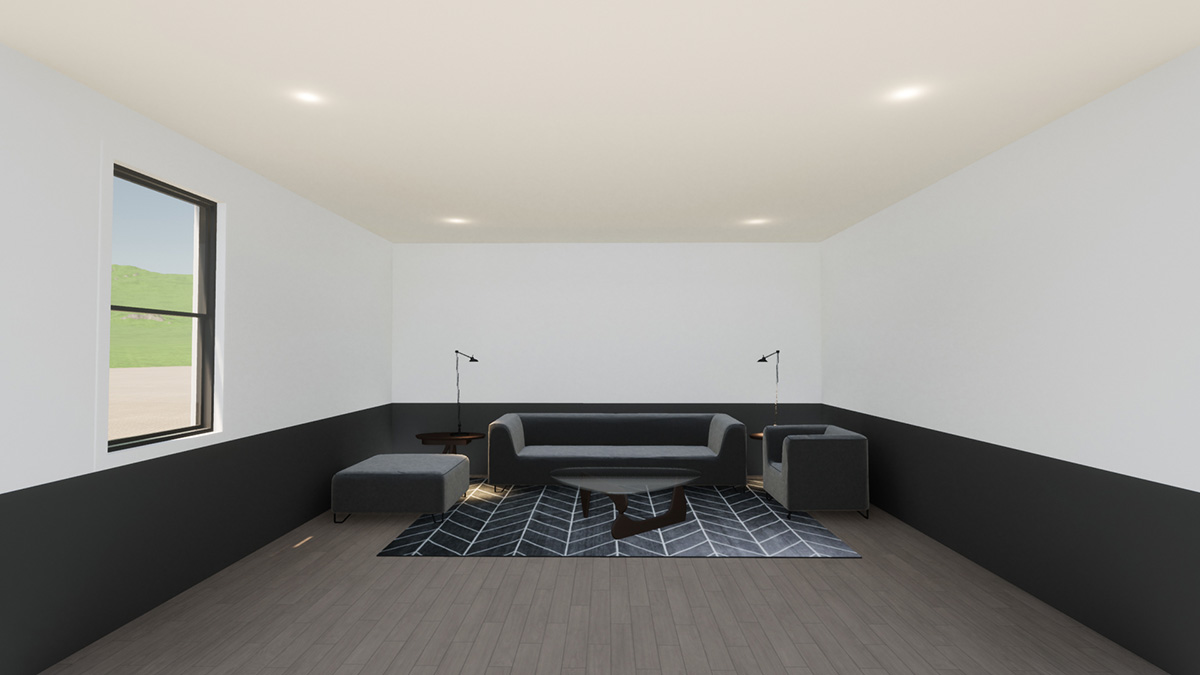
Another method of reducing height is to make the walls appear shorter by applying a darker colour / material to the lower portion of the wall.
This was commonly done in older style buildings where rooms typically had very high ceilings, and was achieved by introducing timber panelling or wall paper to the lower portion of walls.
Reducing depth
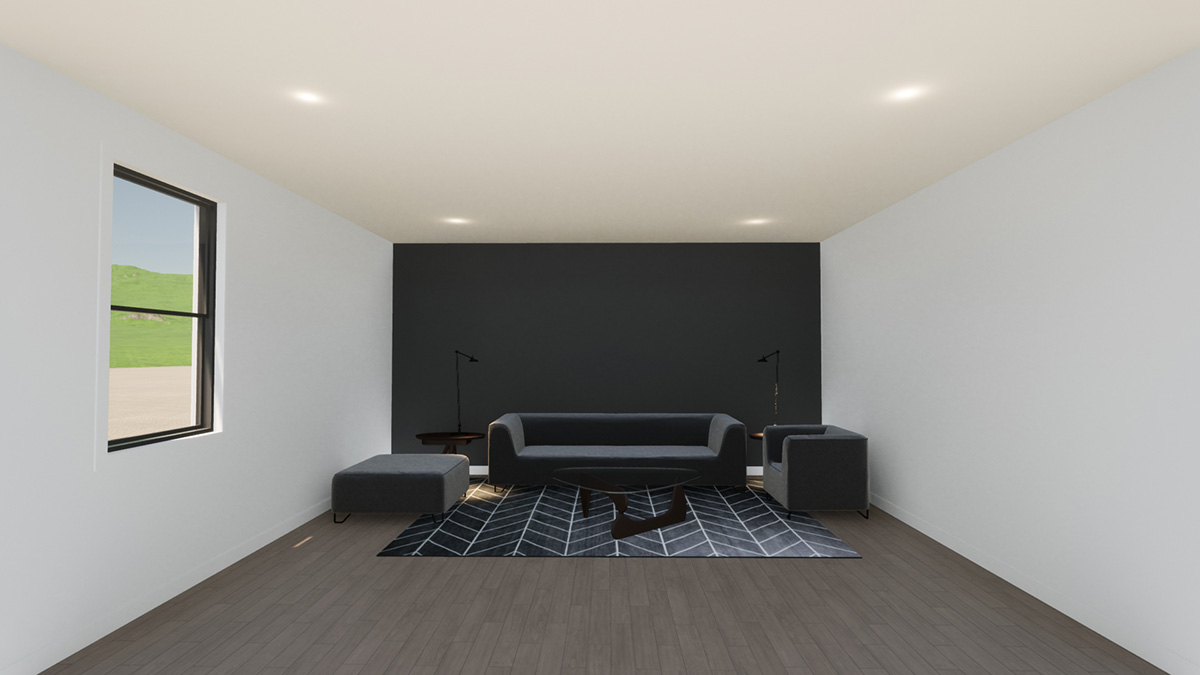
Applying a darker colour to an end feature wall has the effect of bringing it closer and reducing the perceived depth of the room.
Increasing Width
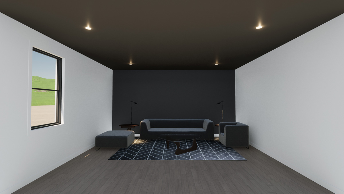
Combining a dark end feature wall and ceiling, the space appears shorter and wider.
This is useful for narrow corridors, stairs or disproportionately long rooms.
Reducing Width
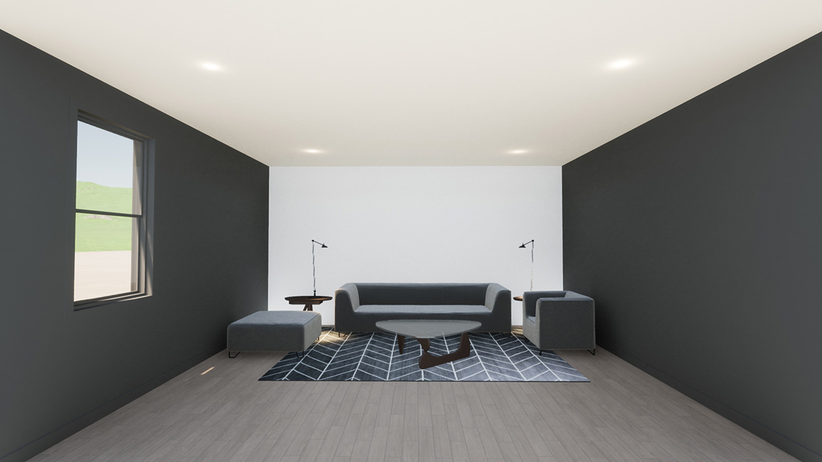
For overly wide rooms, or rooms with low ceilings, applying dark colours to the side walls brings them in closer making the room appear narrower and taller.
Creating a Feature Wall
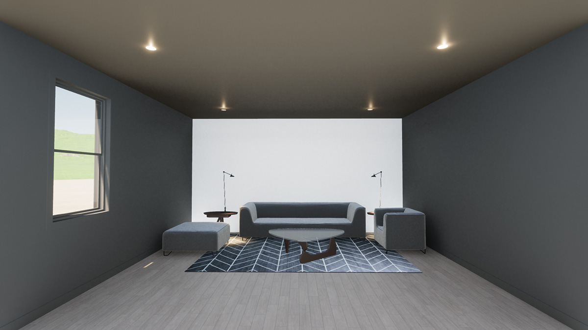
Typically, we tend to utilise predominantly light colours in our homes to promote a sense of spaciousness. Darker colours are often preserved for feature walls.
In fact, the best way to highlight a wall is use a lighter reflective colour surrounded by darker walls and ceilings. The eye is drawn to the brighter element, much like in a theatre where the stage or screen is brightly illuminated whilst the surrounding walls, floor and ceiling are subdued in colour.
Conclusion
Whilst our rooms generally have fixed dimensions, our perception of the space within them can be modified simply by the application of contrasting or feature colours.
Selecting which colours to use however is subject personal taste and design trends.
In 2020, Pantone have nominated classic blue to be the colour of the year.
Given the “blues” many of us are feeling in our current lock down state, it was probably a prescient choice!
To find out more about applications for this colour you can read Pantone colour of the year 2020 Classic Blue.
You might also be interested in...
The Most Popular Home Configurations in Australia in 2024
Discover 2024’s top Australian home configurations: bedrooms, bathrooms, and parking preferences. Explore how changing lifestyles shape popular house configurations nationwide.
Exploring Contemporary Applications of Brise Soleil
Contemporary applications of Brise Soleil combine functionality, aesthetics, and sustainability, making them a popular choice in various building designs worldwide.

